Check out how to build a side navigation that fits perfectly into an admin layout or any dashboard page. We are going to create a simple collapsible sidenav that can be easily integrated into any Angular project that uses Bootstrap.
What we are going to build
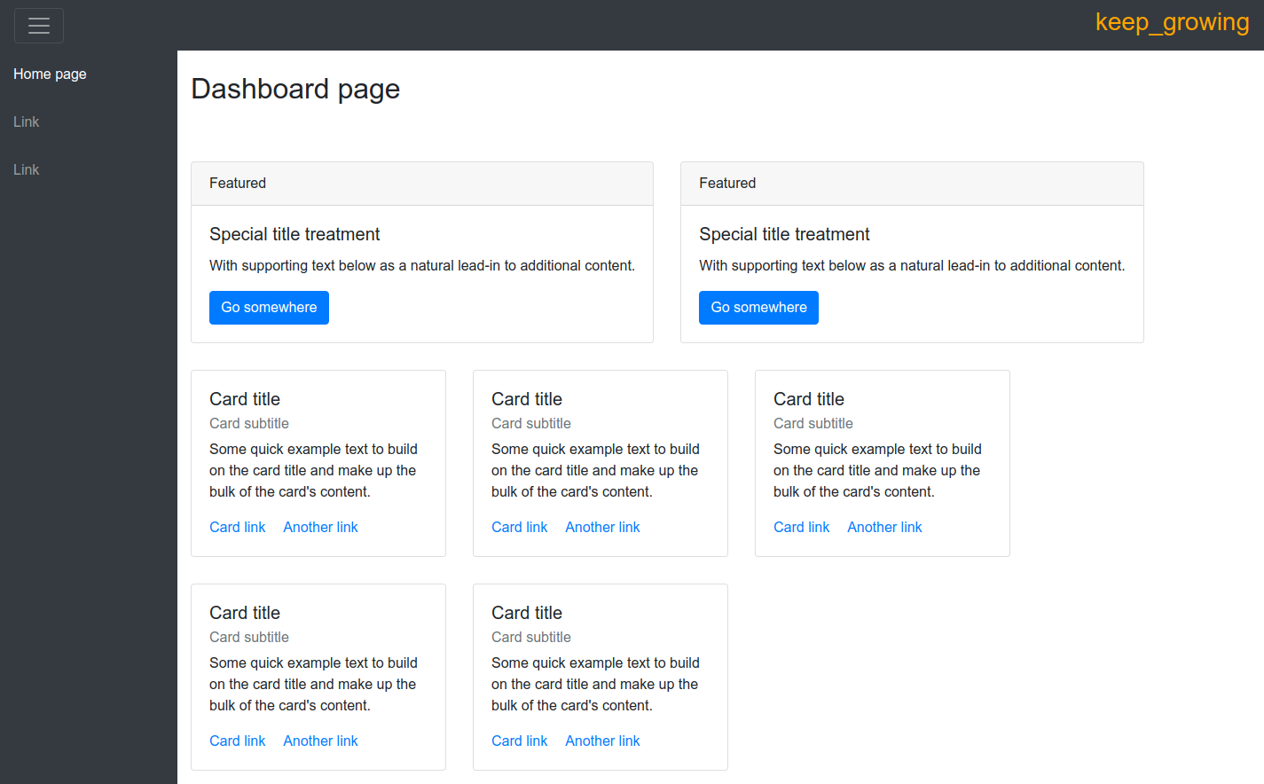
Our goal is to create a collapsible sidenav. We want it to be hidden by default on smaller screens. You can see the component on the screenshot below:

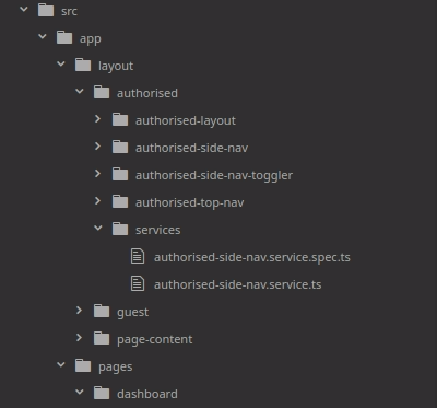
The final project directory tree:

Requirements
| I try to keep the project up to date. Visit the releases list to keep track of the current versions of frameworks and libraries used. |
- Angular CLI – a command line interface tool that generates projects, components, modules, services.
I’m working on:
123456$ ng --versionAngular CLI: 6.0.8Node: 8.11.3OS: linux x64Angular: 6.1.1 - The example app in this post uses the project available on my GitHub repo and described in the Enhance the presentation layer of your multi-layout Angular app post.
- Bootstrap – version ^4.1.3.
Create a service
Generate the service for handling the menu toggle action:
|
1 |
$ ng generate service layout/authorised/services/authorised-side-nav |
The service function is simple, it has a single parameter – hideSideNav – and changes its state every time the function toggleSideNav() is called. See the following code:
|
1 2 3 4 5 6 7 8 9 10 11 12 13 14 15 |
// src/app/layout/authorised/services/authorised-side-nav-service.ts import { Injectable } from '@angular/core'; @Injectable({ providedIn: 'root' }) export class AuthorisedSideNavService { hideSideNav: boolean = false; constructor() { } toggleSideNav(): void { this.hideSideNav = !this.hideSideNav; } } |
Create components
Top bar with the toggler
Let’s start with the top bar to create an elegant and functional frame for our dashboard:
|
1 |
$ ng generate component layout/authorised/authorised-top-nav |
Replace the default content of the view with the following code:
|
1 2 3 4 5 |
<!-- src/app/layout/authorised/authorised-top-nav/authorised-top-nav.component.html --> <nav class="navbar navbar-dark bg-dark"> <app-authorised-side-nav-toggler></app-authorised-side-nav-toggler> <h3>keep_growing</h3> </nav> |
I’m including here the <app-authorised-side-nav-toggler> component so we need to add it to the project as well:
|
1 |
$ ng generate component layout/authorised/authorised-side-nav-toggler |
And put this code in the template:
|
1 2 3 4 |
<!-- src/app/layout/authorised/authorised-side-nav-toggler/authorised-side-nav-toggler.component.html --> <button type="button" class="navbar-toggler" (click)="sideNavService.toggleSideNav()"> <span class="navbar-toggler-icon"></span> </button> |
The toggler requires the AuthorisedSideNavService so we need to import it and inject to the component constructor:
|
1 2 3 4 5 6 7 8 9 10 11 12 13 14 15 16 17 18 |
// src/app/layout/authorised/authorised-side-nav-toggler/authorised-side-nav-toggler.component.ts import { Component, OnInit } from '@angular/core'; import { AuthorisedSideNavService } from '../services/authorised-side-nav.service'; @Component({ selector: 'app-authorised-side-nav-toggler', templateUrl: './authorised-side-nav-toggler.component.html', styleUrls: ['./authorised-side-nav-toggler.component.scss'] }) export class AuthorisedSideNavTogglerComponent implements OnInit { constructor(public sideNavService: AuthorisedSideNavService) { } ngOnInit() { } } |
To add those new components to the dashboard we need to include the top bar in our layout:
|
1 2 3 4 5 6 |
<!-- src/app/layout/authorised/authorised-layout/authorised-layout.component.html --> <app-authorised-top-nav></app-authorised-top-nav> <div class="wrapper"> <app-authorised-side-nav></app-authorised-side-nav> <app-page-content></app-page-content> </div> |
The sidenav
Create the sidebar:
|
1 |
$ ng generate component layout/authorised/authorised-side-nav |
The navigation also requires the AuthorisedSideNavService:
|
1 2 3 4 5 6 7 8 9 10 11 12 13 14 15 16 17 |
// src/app/layout/authorised/authorised-side-nav/authorised-side-nav.component.ts import { Component, OnInit } from '@angular/core'; import { AuthorisedSideNavService } from '../services/authorised-side-nav.service'; @Component({ selector: 'app-authorised-side-nav', templateUrl: './authorised-side-nav.component.html', styleUrls: ['./authorised-side-nav.component.scss'] }) export class AuthorisedSideNavComponent implements OnInit { constructor(public sideNavService: AuthorisedSideNavService) { } ngOnInit() { } } |
In the following code of the component template you can see how we are managing the visibility of the menu only by adding a conditional class to the template – the 'hidden' class:
|
1 2 3 4 5 6 7 8 9 10 11 12 13 14 |
<!-- src/main/angular/src/app/layout/authorised/authorised-side-nav/authorised-side-nav.component.html --> <nav id="sidebar" class="navbar-dark bg-dark" [ngClass]="{'hidden': sideNavService.hideSideNav }"> <ul class="navbar-nav"> <li class="nav-item active"> <a class="nav-link" href="#">Home page</a> </li> <li class="nav-item"> <a class="nav-link" href="#">Link</a> </li> <li class="nav-item"> <a class="nav-link" href="#">Link</a> </li> </ul> </nav> |
Add the following styling rules:
|
1 2 3 4 5 6 7 8 9 10 11 12 13 14 15 16 17 18 19 20 21 22 23 24 25 26 27 28 29 30 31 32 33 34 35 36 37 38 39 40 41 42 43 44 45 46 47 48 49 50 51 52 53 54 |
// src/app/layout/authorised/authorised-side-nav/authorised-side-nav.component.scss :host { background: #343a40; } #sidebar { min-width: 200px; max-width: 200px; min-height: 100vh; color: #fff; transition: all 0.3s; font-weight: 300; font-size: 1rem; line-height: 1.5; } #sidebar.hidden { margin-left: -200px; } a[data-toggle="collapse"] { position: relative; } @media (max-width: 575px) { #sidebar { margin-left: -200px; } #sidebar.hidden { margin-left: 0; } } a, a:hover, a:focus { color: inherit; } #sidebar .sidebar-header { padding: 20px; } #sidebar ul li a { padding: 15px; display: block; width: 100%; &:hover { background-color: rgba(255, 255, 255, 0.1); } } hr { border-top: 1px solid #fff; margin-top: 0; } |
On a smaller screen the sidenav is hidden by default, you can still toggle its visibility by clicking the button on the top nav:

The work done in this section is contained in the commit 9300c12c207ba6f53eddbe2424a6aa33b8d629f7.
Fix the tests
Remember to include @Component in tests for components that contain other element:
|
1 2 3 4 5 6 7 8 9 10 11 12 13 |
//src/app/layout/authorised/authorised-top-nav/authorised-top-nav.component.spec.ts … import { Component } from '@angular/core'; @Component({selector: 'app-authorised-side-nav-toggler', template: ''}) class AuthorisedSideNavTogglerComponent {} … TestBed.configureTestingModule({ declarations: [ AuthorisedTopNavComponent, AuthorisedSideNavTogglerComponent ] … |
|
1 2 3 4 5 6 7 8 9 10 11 12 13 |
// src/app/layout/authorised/authorised-layout/authorised-layout.component.spec.ts … @Component({selector: 'app-authorised-top-nav', template: ''}) class AuthorisedTopNavComponent {} … beforeEach(async(() => { TestBed.configureTestingModule({ declarations: [ AuthorisedLayoutComponent, AuthorisedSideNavComponent, AuthorisedTopNavComponent, PageContentComponent ] |
The work done in this section is contained in the commit abd35eaeb9f689c5a84d3964c18bad789f57f43a.
Photo by Alice Moore on StockSnap

Very Nice Post
Excellent! Simple and concise. Very useful. Thank you very much.
Excellent! Can you help me to understand how can we keep sidebar at right instead of left?
Excellent. Thank you.